Let’s talk about lay research, one of the cornerstones of science, and reproducibility, another, and doing one’s research and homework before putting something out in the world when developing even trivial things like iOS Shortcuts-driven Widgets.
Problem/Position statement (or, how did I get into this mess?): So previously, I wrote up how I was displaying temperature from a local PurpleAir sensor into a widget on the home screen of my iPhone, recently upgraded to iOS 14 (14.1 now), and what my product search journey was to get that done to my liking.
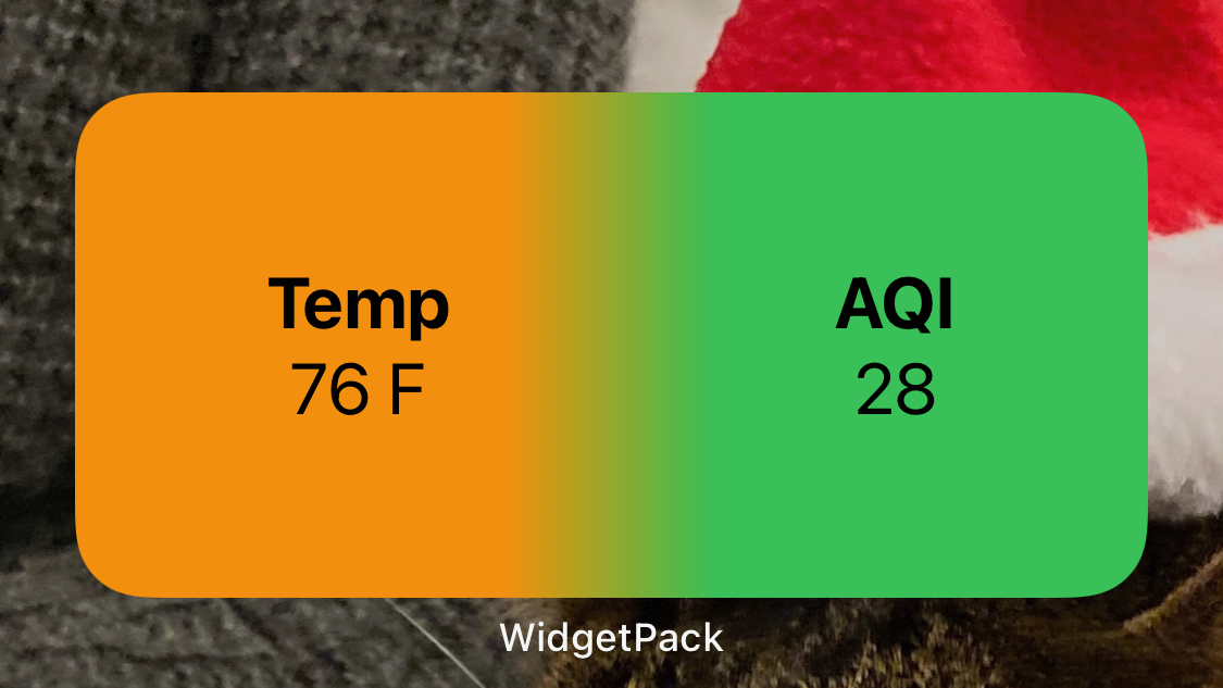
After I proudly showed my result to my partner, she challenged me to also display the AQI in the same widget, “perhaps with a gradient”. Which is cool. I had to figure out how to do more complex visual stuff, and I had to get the AQI. “Easy,” thought I, innocently.
I mean it only took a day. Or two.
Complexity: You see, the sensors only output AQI as a measurement in micrograms per cubic meter, and the US EPA’s AQI index is a unit-less number, so how do you get from one to the other? My task was to figure this out. It’s all public information, right? Because the US EPA is a Federal department. So to Google I went.
This turned out to yield a non-trivial answer. I found:
- An internal write up from someone in PurpleAir from 2017 about how to get from their sensors to an AQI reading, but it was missing some key information. They even provided Javascript for doing the conversion but the key function in the doc, called “CalcAQI()”, had a number of variables they left undefined in the write up. Also the JSON API described in the 2017 document differed pretty significantly from what I was seeing from the live data.
- A blog post on calculating AQI globally, from 2013. Fascinating reading.
- The EPA data sources and definitions around calculating the AQI.
- The PurpleAir FAQ and technical notes on how to work with their sensors and their data for programming. Also a very good grounding on the work in general that I’d gotten myself into.
- An EPA write up (Version 2) of the problem they had with PurpleAir’s data, with complex statistical analysis, and some hopeful looking suggested correction and calibration formulas.
Armed with this information, I tried to replicate what figures I was currently seeing with PurpleAir. I took the values I could from the local sensors realtime JSON output, and I compared trial output I generated in Excel with those formulas to PurpleAir’s visual mapping utility. AND I DID NOT GET ANYWHERE NEAR the values PurpleAir was generating. So… back to the drawing board.
It occurred to me to look at PurpleAir’s map and see if there was any info in their Conversion help topic on the map itself. It was perfect.
They linked to the updated version of the EPA write up (Version 4?) which actually has the correct formula for converting. How do I know? I took that version and reproduced it in Excel, and I took real-time sensor data and calculated what I should see on PurpleAir’s sensor map and I did that 5 times – every time the data or the map changed, to make sure the conversion was working reasonably properly.
The missing link here was that while there was a correction algorithm for the micrograms per cubic meter, there was still an implied algorithm in the AQI “breakpoint” charts – converting each segment of micrograms per cubic meter to the unit-less Air Quality Index value. Though it was pretty easy to come up with the algorithm, I’m still proud of the careful work behind both.
Upon vetting that I knew with reasonable certainty that I had the right conversion formula, I wrote the algorithm in the Shortcuts interpreted language.
This is the sort of basic minimum, for my work, that I see a lot of people new to programming, and new to statistics, number- and calculation-based science, and new to data analytics, fail to do. And it’s a shame. But seriously, folks. If you want to do something math-y, and you want to put it in your widget or your app or your website, PLEASE:
- Find out what the official math is, or what you think it is.
- Model it in a spreadsheet or some basic workbook like a Jupyter Notebook.
- Find an official source to vet your results against.
- Run tests for 5 or 10 or 100 or 1000 sample values that you can vet against to be sure you either have 100% fidelity or a close approximation to 100% fidelity.
- If everything checks out, and you think you do have a good approximation of the official math, THEN publish your widget or app or whatever.
Don’t use lay-researchers as your beta testers for not doing your homework and releasing crap math out into the world. We have enough global strategic reserves of crappy math and crappy science. We don’t also need yours to gum up the works.
If you want to drill down into the algorithm in the Shortcut: Shortcuts is a high level programming language, but it doesn’t have deluxe programming features. While other languages might have a case/switch structure to do complex comparison-driven algorithms, you have to do nested If-then/else statements. This Shortcut is currently at 119 steps, or actions.
Here’s a sample of the logic from the AQI correction algorithm and the beginning of the micrograms per cubit meter value to the AQI within the Shortcuts app:

The primary steps handling data in the app are:
- Gather temperature reading from the sensor and correct it by subtracting 8F from the value read for the heating factor PurpleAir publishes about the plastic housing for the sensor for outdoor sensor.
- Figure out the color for the corrected temperature.
- Gather the appropriate readings from the A and B sensors for the PM2.5 Value.
- Gather the humidity reading from the sensor.
- Calculate the correction value for the micrograms per cubic meter using the formula: 0.52*(Average of A and B readings for the PM2.5 value)-0.085*(Humidity)+5.71
- Use the EPA AQI Breakpoint chart to algorithmically convert the micrograms per cubic meter to the AQI value:
- Less than 12 ug/m^3: CorrectedAQI/12*50
- Between 12 and 35.4: (Corrected AQI – 12)/23.4*50+50
Note: the – 12 is the lower breakpoint high value, 23.4 is the difference between 35.4 and 12, the range of this breakpoint section, the first 50 is the range of the AQI index bracket being figured, and the second 50 is the high AQI value of the next lower bracket. - This goes on for values of ug/m^3 up to and over 500.4.
- Take the AQI and round it to the nearest integer.
- Figure out the EPA index color from the AQI value, ranging from green to maroon.
- Take all of this together with WidgetPack to present the data and the graphics.